
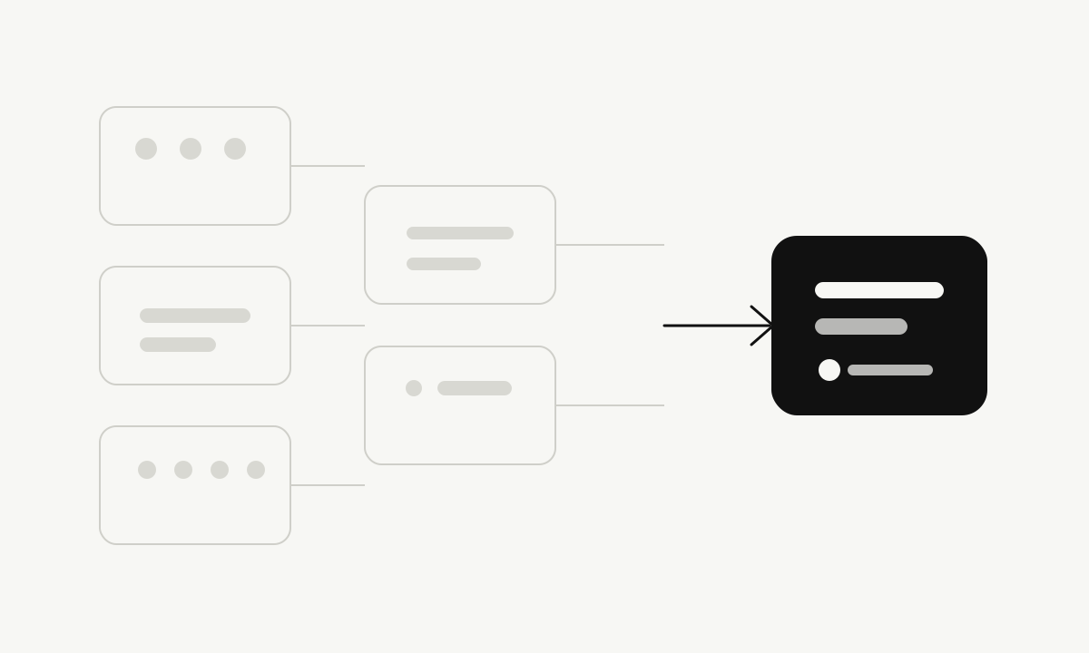
Complexity is easy to add because every new feature can sound reasonable by itself. The difficult work is deciding how those features fit together, which ones deserve attention, and which ones create more confusion than value. Simplicity is the discipline of protecting the user from unnecessary decisions while preserving the capability they actually need.
Complexity usually arrives one reasonable decision at a time
Most products do not become complicated because a team intentionally wants a confusing interface. Complexity usually grows slowly. One user asks for another setting. A competitor launches a feature. A new plan is added for a different customer group. A new AI mode appears useful. A shortcut is added because a workflow feels too slow.
Each addition can make sense on its own. The problem appears when the product is viewed as a whole. The user now sees more buttons, more labels, more pricing choices, more settings, and more ways to make the wrong decision.
The internal cost grows at the same time. More states create more code paths. More plans create more billing rules. More permissions create more authorization cases. More AI modes create more routing, testing, and cost uncertainty. Complexity eventually becomes a product problem, an engineering problem, and a support problem at the same time.
Start with the primary job
Every product should be able to answer a basic question: what is the main thing the user came here to do?
A trading journal exists to help a trader record, review, and understand trading behavior. A whiteboard exists to help people think visually and organize ideas. An AI learning workspace exists to help users learn, research, write, build, and work more effectively. A website builder exists to help someone move from an idea to a usable site.
The first screen should support that primary job. Secondary tools can remain available, but they should not compete with the main task for equal attention. When every feature is presented as important, the product stops helping the user decide what matters.
A practical test
Ask what a new user should understand within the first minute. If the answer requires a long explanation of plans, modes, agents, settings, and internal system names, the product is probably exposing too much complexity too early.
Good hierarchy makes capability easier to discover
Simplicity does not require hiding useful capability forever. It requires presenting capability in the right order. Basic actions should be visible. Advanced actions should become available when the task requires them.
This is often called progressive disclosure. The principle is straightforward. A beginner should be able to start without understanding the entire product. An experienced user should still be able to reach deeper controls without fighting the interface.
Good hierarchy is especially important in AI products because the underlying system may have models, tools, permissions, retrieval, verification, memory, and background processes. Most users do not need to manage those parts directly. They need a clear experience that gives them control where control matters.
Defaults are product decisions
A default is not a neutral choice. It shapes what most users experience. Good defaults should be understandable, safe, and appropriate for the common use case. They should also be reversible when possible.
A product should not choose defaults that quietly increase spending, expose more information, or enable risky behavior because that benefits the business. The easier choice for the user should also be a responsible choice.
In AI products, this can affect which model is selected, when external tools are allowed, how much context is shared, and when a user is asked to confirm an action. The system can handle much of this complexity in the background without pretending that the complexity does not exist.
Pricing should be easy to understand
Pricing is part of product design because it changes how users think and behave. If people need a spreadsheet to understand a plan, the pricing model is probably too complicated.
A user should be able to understand what is free, what has a limit, what requires payment, and what happens when the limit is reached. The interface should not rely on fake popularity labels, artificial urgency, or repeated upgrade pressure to create conversion.
A stronger approach is to connect payment to clear value. Let the free experience be useful within reasonable limits. Make those limits visible. When an upgrade becomes necessary, explain what the user receives and allow them to decide without interruption or pressure.
AI should simplify the product, not multiply it
AI creates a strong temptation to add more personalities, more agents, more modes, and more controls because each new capability can look impressive in a demonstration. That does not mean every capability deserves its own place in the interface.
A better question is whether the user needs to understand the internal difference. If several AI processes can work together behind one clear task, the interface should usually present the task, not the architecture.
This also improves long term flexibility. Models and providers can change without forcing the user to relearn the product every time the infrastructure changes.
Simplicity improves security and maintenance
Every extra permission, integration, account state, billing path, file workflow, and administrative action creates another area that needs testing and protection. Reducing unnecessary surface area can make a system easier to secure because there are fewer paths to reason about.
Simplicity also improves maintenance. A smaller number of well designed workflows are easier to test, document, monitor, and support. This matters for small teams because engineering attention is limited. Time spent maintaining weak features is time not spent improving the core product.
Remove before adding
The most useful product review question is often not “What should we add?” but “What can we remove, combine, rename, or move out of the way?”
Before introducing a new feature, ask whether an existing workflow can solve the problem. Before adding a new plan, ask whether the current pricing can be explained more clearly. Before adding another AI mode, ask whether the existing experience can do the same job with less friction.
The discipline is simple to describe and difficult to practice: keep what creates real value, improve what is unclear, and remove what makes the product heavier without making it better.
Simplicity is a continuous process
A simple product today can become complicated next year if the team stops reviewing it. Product growth naturally creates pressure to add more. That is why simplicity has to be maintained deliberately.
The goal is not minimalism for its own sake. The goal is clarity. A user should feel that the product understands the task, presents the right choices, and stays out of the way when it has nothing useful to add.